 1
 2
 3
 4
 5
 6
 7
 8
 9
10
11
12
13
14
15
16
17
18
19
20
21
22
23
24
25
26
27
28
29
30
31
32
33
34
35
36
37
38
39
40
41
42
43
44
45
46
47
48
49
50
51
52
53
54
55
56
57
58
59
60
61
62
63
64
65
66
67
68
69
70
71
72
73
74
75
76
77
78
79
80
81
82
83
84
85
86
87
88
89
90
91
92
93
94
95
96
97
98
99
|
import 'package:flutter/material.dart';
import 'package:roundcheckbox/roundcheckbox.dart';
class RoundCheckboxPage extends StatelessWidget {
static const double roundBoxSize = 50;
const RoundCheckboxPage({super.key});
@override
Widget build(BuildContext context) {
return Scaffold(
appBar: AppBar(
title: const Text(''),
),
body: SizedBox(
width: double.infinity,
child: Column(
children: [
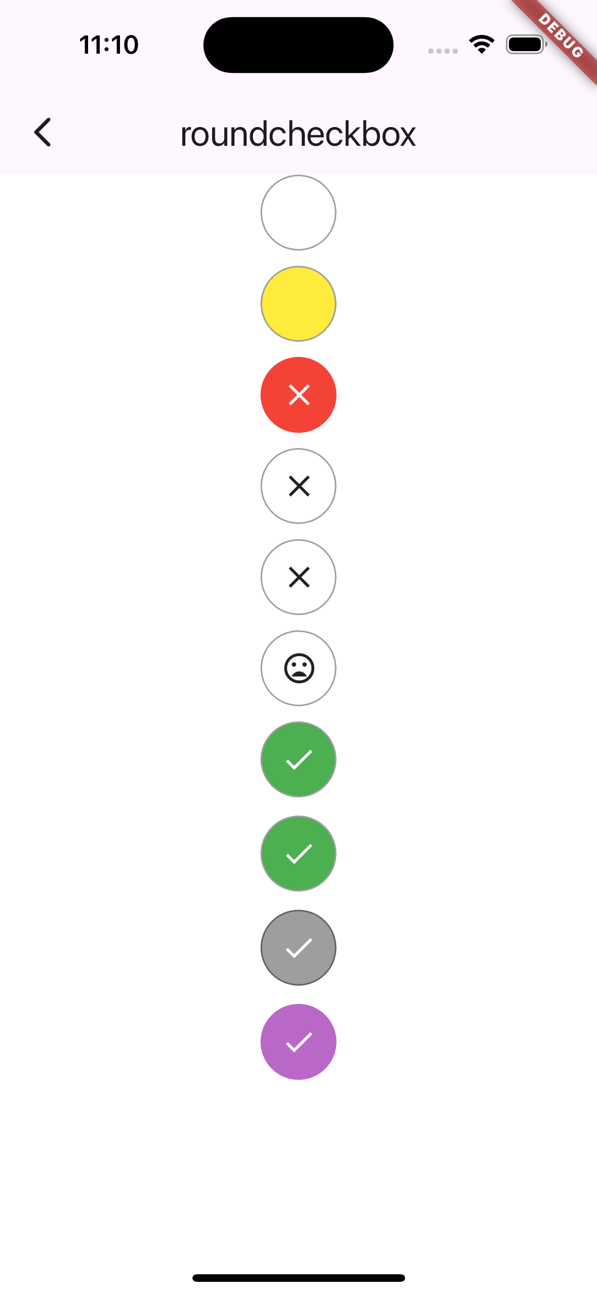
RoundCheckBox(
onTap: (selected) {},
size: roundBoxSize,
),
const SizedBox(height: 10),
RoundCheckBox(
onTap: (selected) {},
size: roundBoxSize,
uncheckedColor: Colors.yellow,
),
const SizedBox(height: 10),
RoundCheckBox(
onTap: (selected) {},
border: Border.all(
width: 4,
color: Colors.red,
),
uncheckedColor: Colors.red,
uncheckedWidget: const Icon(Icons.close, color: Colors.white),
size: roundBoxSize,
),
const SizedBox(height: 10),
RoundCheckBox(
onTap: (selected) {},
uncheckedWidget: const Icon(Icons.close),
size: roundBoxSize,
),
const SizedBox(height: 10),
RoundCheckBox(
onTap: (selected) {},
uncheckedWidget: const Icon(Icons.close),
animationDuration: const Duration(
milliseconds: 50,
),
size: roundBoxSize,
),
const SizedBox(height: 10),
RoundCheckBox(
onTap: (selected) {},
checkedWidget: const Icon(Icons.mood, color: Colors.white),
uncheckedWidget: const Icon(Icons.mood_bad),
animationDuration: const Duration(
seconds: 1,
),
size: roundBoxSize,
),
const SizedBox(height: 10),
RoundCheckBox(
onTap: (selected) {},
uncheckedWidget: const Icon(Icons.close),
isChecked: true,
size: roundBoxSize,
),
const SizedBox(height: 12),
RoundCheckBox(
onTap: (selected) => debugPrint('RoundCheckBox $selected'),
uncheckedWidget: const Icon(Icons.close),
isChecked: true,
size: roundBoxSize,
),
const SizedBox(height: 12),
const RoundCheckBox(
onTap: null,
uncheckedWidget: Icon(Icons.close),
isChecked: true,
size: roundBoxSize,
),
const SizedBox(height: 12),
RoundCheckBox(
onTap: null,
uncheckedWidget: const Icon(Icons.close),
disabledColor: Colors.purple[300],
isChecked: true,
size: roundBoxSize,
),
],
),
),
);
}
}
|