官方链接见https://pub-web.flutter-io.cn/packages/popup_menu
支持Android/iOS/linux/MacOS/Web/Windows
2.pubspec.yaml添加依赖
3.示例
3.1 定义菜单项
 1
 2
 3
 4
 5
 6
 7
 8
 9
10
|
import 'package:custom_pop_up_menu/custom_pop_up_menu.dart';
List<ItemModel> menuItems = [
  ItemModel('复制', Icons.content_copy),
  ItemModel('粘贴', Icons.content_paste),
  ItemModel('转发', Icons.send),
  ItemModel('收藏', Icons.collections),
  ItemModel('删除', Icons.delete),
  ItemModel('分享', Icons.share),
  ItemModel('搜索', Icons.search),
];
|
通过menuItems构造菜单项,调用PopupMenu构造方法,然后,通过PopupMenu的show方法显示菜单。
 1
 2
 3
 4
 5
 6
 7
 8
 9
10
11
12
13
14
15
16
17
18
19
20
21
22
23
24
25
|
   void _showPopupMenu(BuildContext context) {

      List<MenuItem> popupMenuItems = menuItems.map((item) {
        return MenuItem(
            title: item.title,
            image: Icon(
              item.icon,
              size: 20,
              color: Colors.white,
            ),
            textStyle: const TextStyle(color: Colors.white, fontSize: 12));
      }).toList();

      final popupMenu = PopupMenu(
        items: popupMenuItems,
        onClickMenu: (MenuItemProvider item) {
          debugPrint('Selected:${item.menuTitle}');
        },
        onDismiss: () {
          debugPrint('Menu is dismissed');
        },
        context: context,
      );
      popupMenu.show(widgetKey: btnKey);
    }
|
其中为按钮的btnKey,声明如下
1
|
final GlobalKey btnKey = GlobalKey();
|
调用如下
1
2
3
4
5
|
   ElevatedButton(
        key: btnKey,
        onPressed: () => _showPopupMenu(context),
        child: const Text('显示popup_menu')
  )
|
4.效果
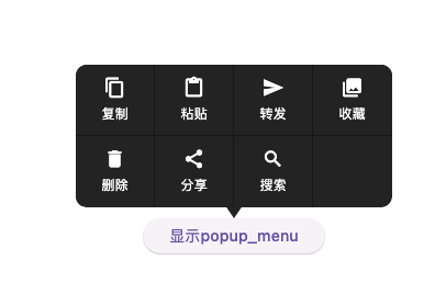
选中菜单时,onClickMenu先触发,然后,调用onDismiss
1
2
3
4
5
|
flutter: Selected:粘贴
flutter: Menu is dismissed
flutter: Selected:转发
flutter: Menu is dismissed
|
5.其它
5.1. 小结
上述菜单,属于很常见的一种自定义菜单,效果通常可以满足一般使用,样式可简单定义。
关于PopupMenu菜单构造时,可以传递MenuConfig,可以调整菜单样式。其属性如下
 1
 2
 3
 4
 5
 6
 7
 8
 9
10
11
|
  const MenuConfig({
    this.type = MenuType.grid,
    this.itemWidth = 72.0,
    this.itemHeight = 65.0,
    this.arrowHeight = 10.0,
    this.maxColumn = 4,
    this.backgroundColor = const Color(0xff232323),
    this.highlightColor = const Color(0xff353535),
    this.lineColor = const Color(0x55000000),
  });
|
- type: 默认格子(grid),还支持单列 (list)
- itemWidth、itemHeight: 菜单项宽度与高度
- arrowHeight:箭头的高度
- maxColumn:格子类型菜单最大列数
- backgroundColor:背景色
- highlightColor:点击的高亮色
- lineColor:分隔线的颜色
文章作者
梵梵爸
上次更新
2024-04-22
许可协议
原创文章,如需转载请注明文章作者和出处。谢谢